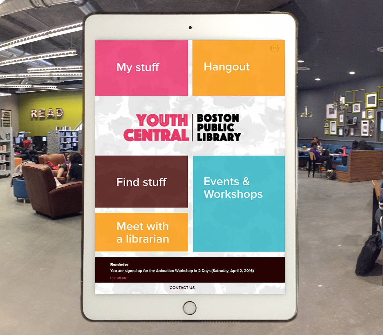
Youth Central App
The Youth Central app enables students to sign-up for events or research assistance, borrow library resources, and store and share projects created in BPL workshops. The app uses NFC (Near Field Communications) technologies to make many of these processes feel effortless.
Check out the video below to hear a summary of my project and two use case scenarios for the Youth Central app.
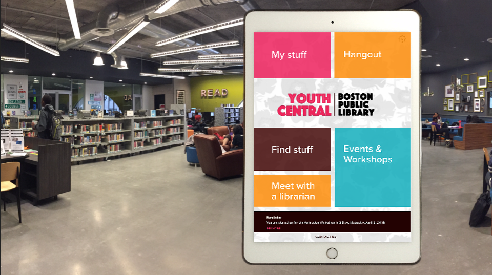
Youth Central App
Assignment
The goal of this class project was to create an innovative, interactive application that streamlines processes for a local business or institution.
My Process
The first step in the discovery phase was to visit the main branch of the BPL to conduct ethnographic studies. These visits helped determine which library systems were most visibly used by visitors and patrons and which improvements might have the biggest impact.
During the brainstorm phase I diagrammed library systems to find commonalities. To no surprise it was the acquisition and use of free library materials, like books, periodicals, and videos, that was the common thread. In addition, I created a matrix of all the library elements to see how different combinations of them might inspire an interesting project idea.
The BPL has specialty rooms throughout the library, but the teen program was the most complex. To simplify many of the processes, I decided to use NFC technologies because it reduced the need for interface interactions. Voice recognition was not a good fit for this project because of the need for quietness in the library.
To begin the user experience and visual design phases I mapped user and staff interactions, created mood boards, wireframes, and InVision mock-ups. And through a series of class critiques and design iterations, I created desktop and mobile designs for two scenarios, as seen in the video above.
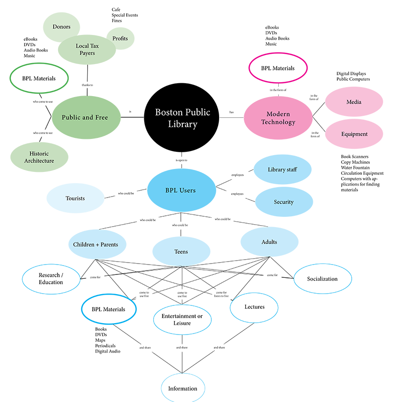
(Above) A mapping exercise to help determine commonalities. View larger map.
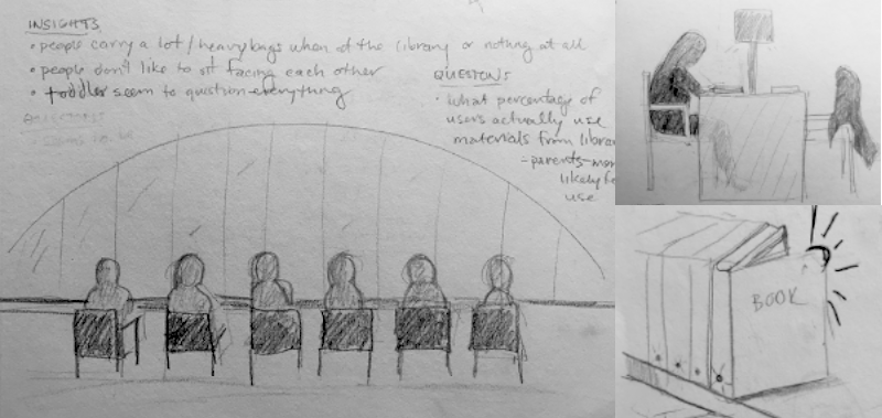
(Above) Sketches from my ethnographic study at the BPL.
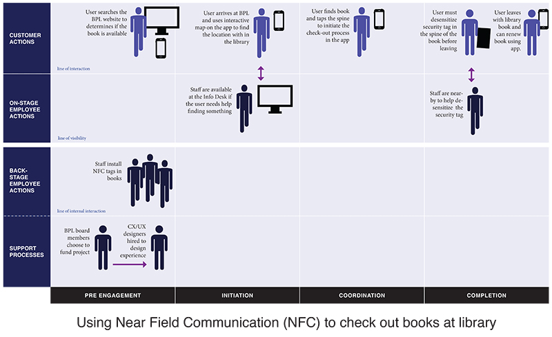
(Above) Customer experience chart for using NFC, showing key actions and interactions with staff.
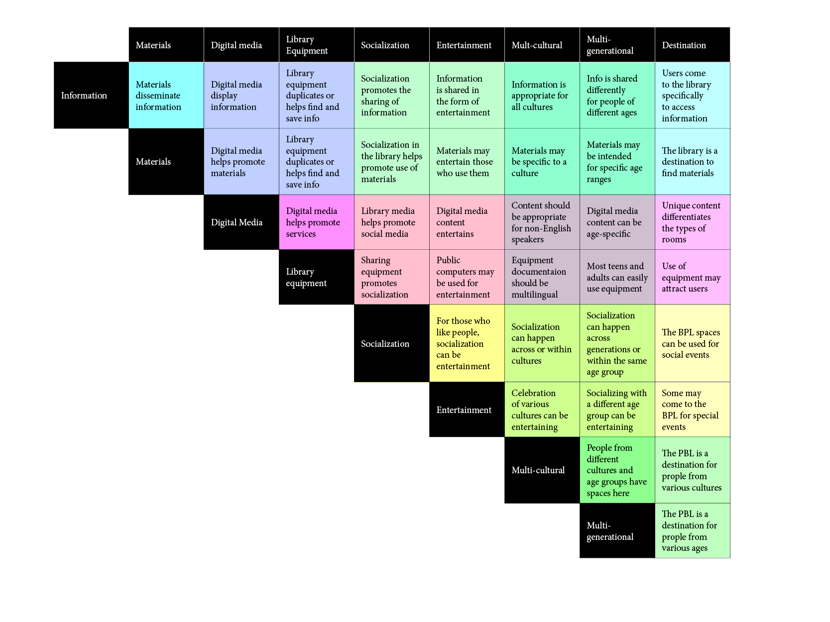
(Above) A matrix exercise to help determine project concept
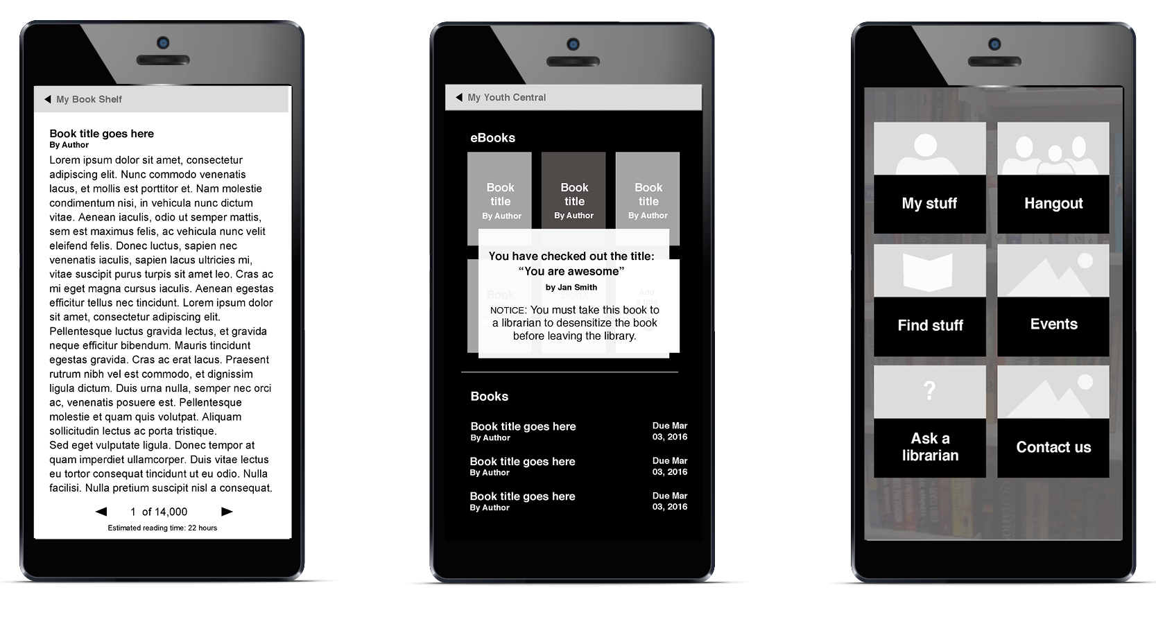
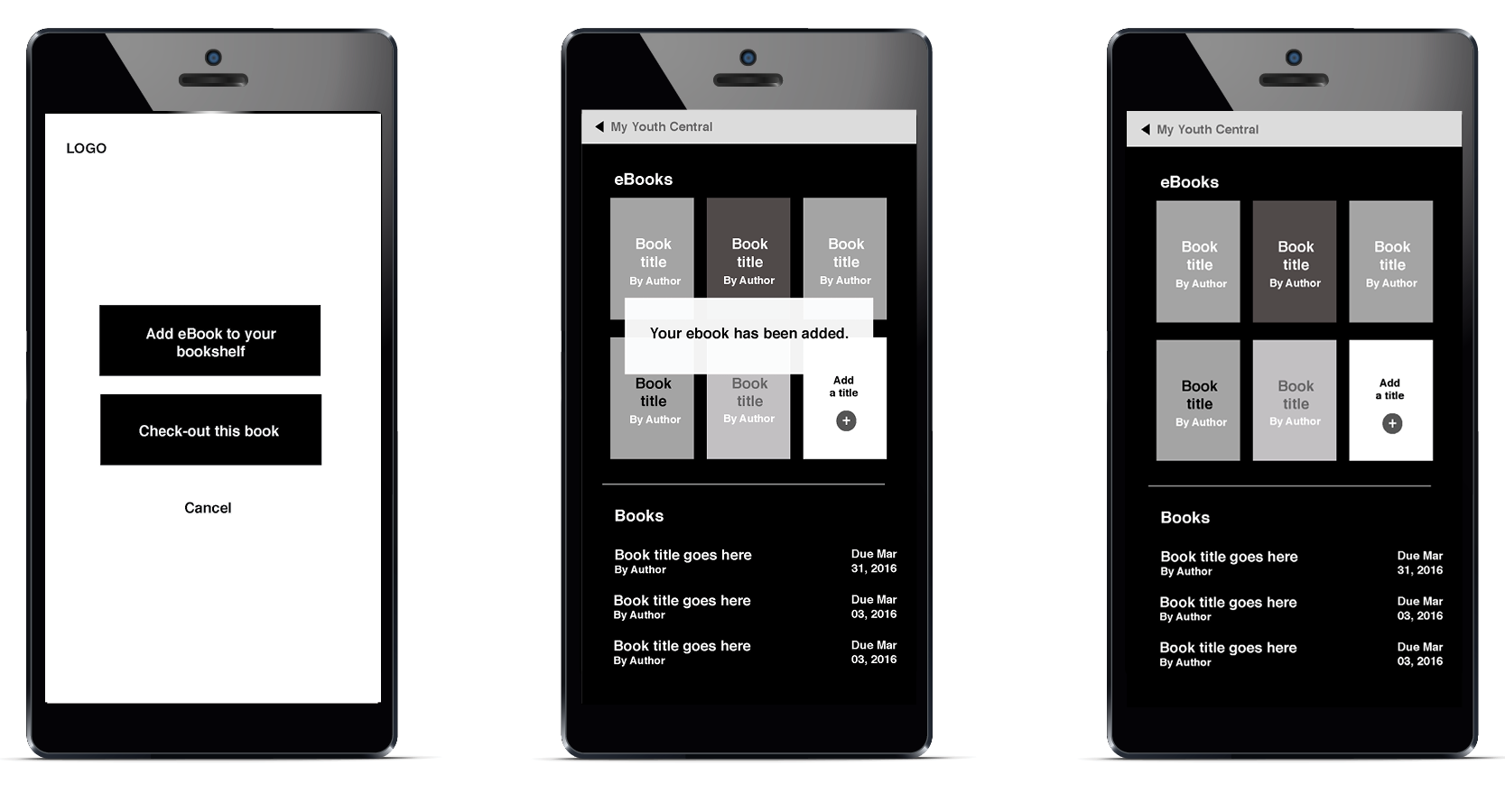
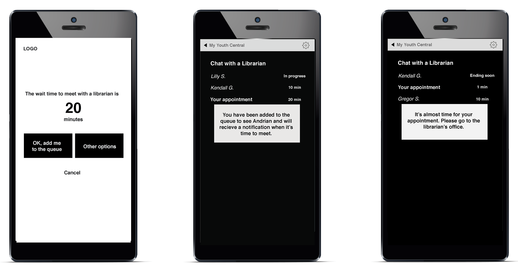
By creating wireframes for the mobile experience, I am able to refine the user experience quickly before moving onto the design phase, ultimately saving time in the design phase.
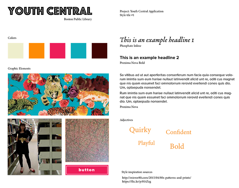
At the beginning of the visual design phase, I created three mood/style boards to determine the general look and feel of the app. I narrowed down my choices to this option whose vibrancy and youthfulness best matched the experience I was aiming for.
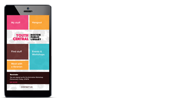
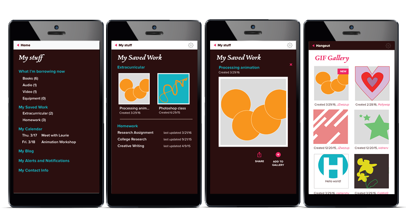
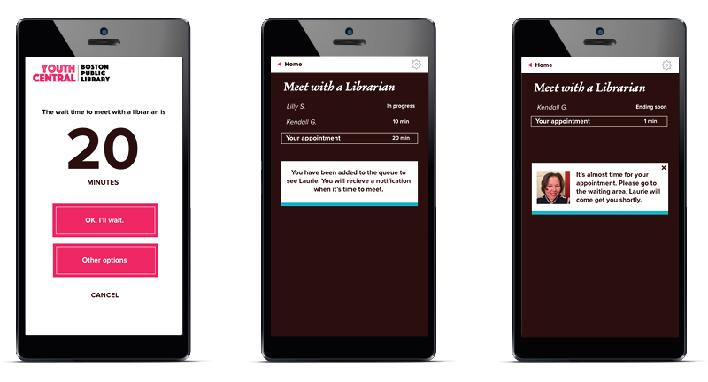
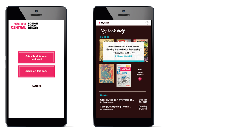
After creating the designs in Sketch I mocked-up the designs in Photoshop for my final presentation.